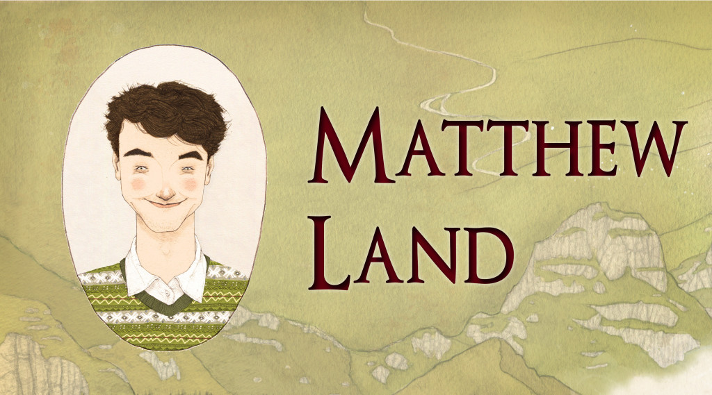
#FlorisDesign Illustrator Interview: Matthew Land
by Floris Books • 3 June 2015 • Children's Books, Design and Illustration, Floris Design, Traditional Scottish Tales • 0 Comments
Illustrator of…
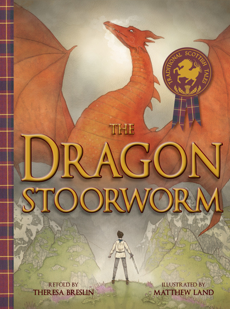
Today with #FlorisDesign, we’re chatting with Matthew Land, the illustrator of Theresa Breslin’s dramatic tale The Dragon Stoorworm, about his work and creative processes.
Hi Matthew! Thanks for talking to us. We were wondering where you looked for inspiration when you started your illustrations for The Dragon Stoorworm?
Theresa’s words were so wonderfully written and descriptive that I didn’t find it hard to fall in love with the story she was telling. I then created a folder of inspiration on my computer and dropped into it anything I came across that might be helpful. Towards the end of the project, the folder had gotten so meticulous and extensive that I have a file on my hard drive entitled ‘Princess G* Hair’. I also watched a number of films; Disney’s Brave was helpful.
*Princess Gemdelovely is one of the main characters in the story for those of you who have yet to read it!
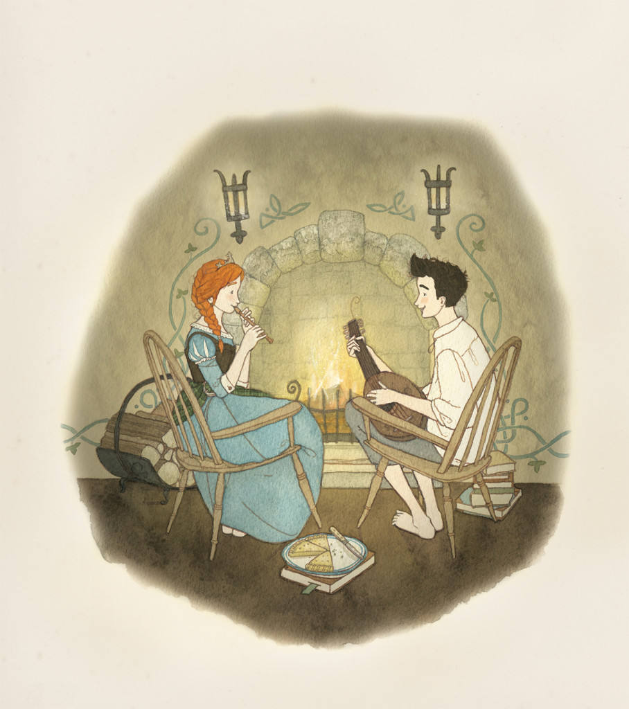
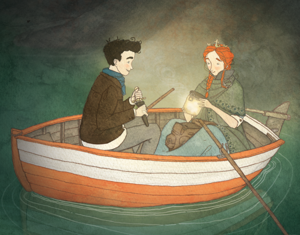 Princess Gemdelovely and Assipattle
A princess with her own folder of hair-dos! It’s such a tricky part of illustrating to get right, it’s great idea to find reference material. With that in mind, how much of what you draw comes from imagination, and how much from research?
For me, it’s a tight balance between the two; research helps ground my imagination. It’s the research that provides a large portion of the detail within the illustrations, and I think that’s where my work has its appeal.
With such an epic story, what aspects of the story gave you the strongest visual image?
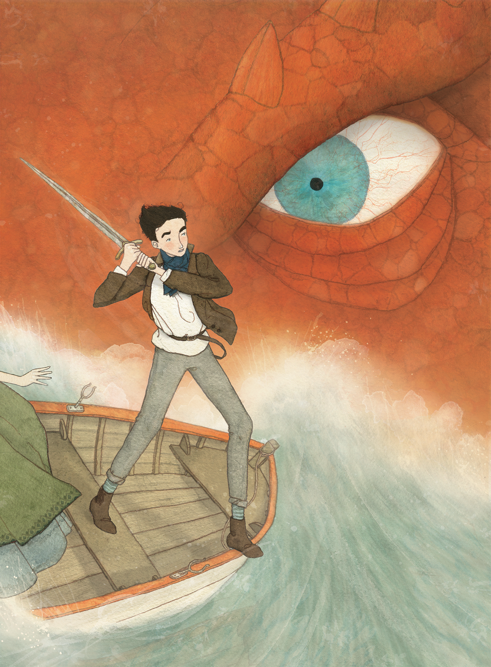
The spread where Assipattle is about to thwack the Stoorworm with the sword was the strongest image for me. It was also the most challenging one, because I’m not naturally good at conveying action. It was the pencil rough I put off until last because I had to work longer on the ideas. I was very aware that if I didn’t work on it, the image would just be a stilted/generic hero-slays-the-dragon scene.
We think you’ve managed to avoid any sort of generic illustration admirably! Do you have any favourite spreads or vignettes?
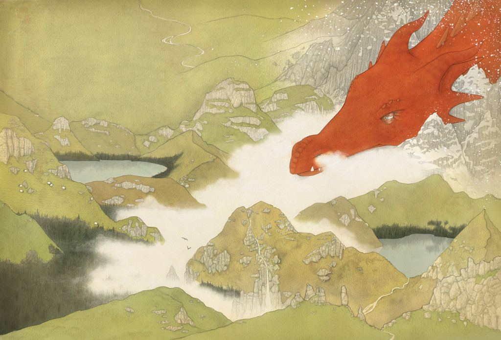
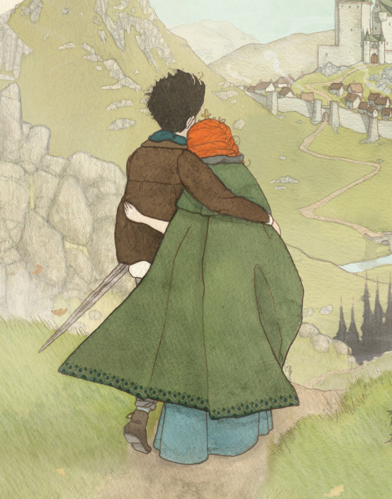
My 1st favourite is the first spread where the dragon is laid out amongst the mountains because it was the one that flowed most easily from idea to imagery. Also, it was the rough that got me the job. My 2nd favourite is the vignette on the last page, because although it is quite simple compared to some of the other spreads – though the untrained eye might not detect it – I can see some of my strongest work in it. Also, everyone needs a good happy ending.
The first spread of The Dragon Stoorworm
We love your first spread too; we knew you were right for the job as soon as the rough for this spread came into the office. Now, as well as all the beautiful spreads you created, you also designed your own endpapers; are patterns something you enjoy creating?
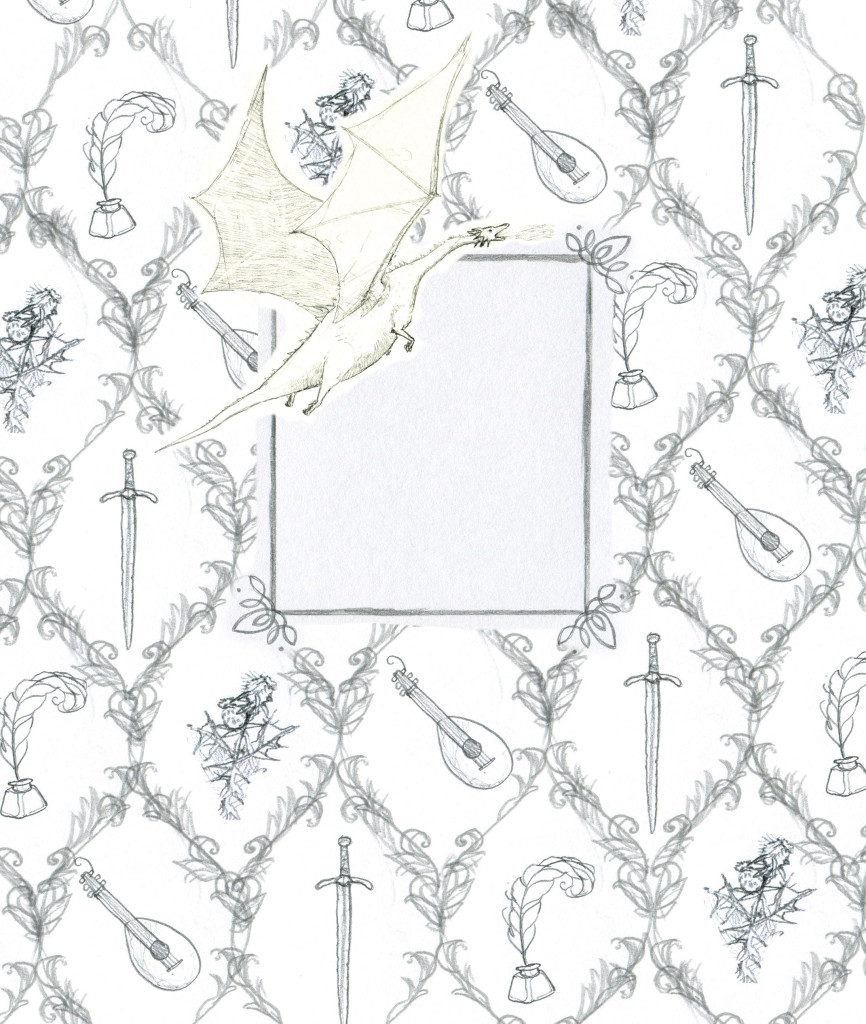
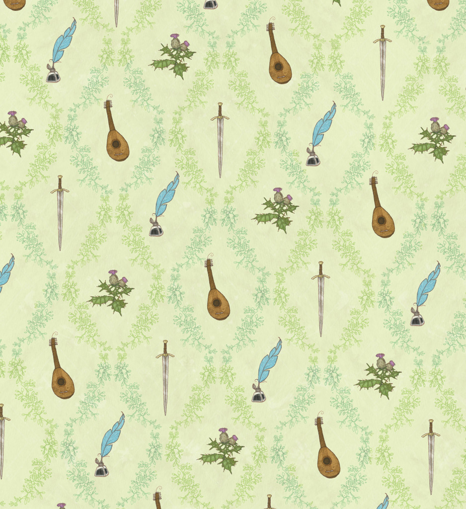
I am a big fan of patterns, they make things look nicer. When it all comes down to it, I (not so secretly) just like making things look pretty. Creating patterns is also very relaxing, the repetitiveness puts my brain onto cruise control. *whispers* And you can just paint a small portion and then copy and paste.
Matthew’s rough (first draft) endpapers
The final endpapers!
That’s a great job for Photoshop. With so many different visual elements going on, can you tell us how you decided on the colour palette for The Dragon Stoorworm?
Colour is the biggest part of my work but also the most challenging thing to get right. That’s the main reason I appreciate the invention of Photoshop. The biggest challenge (colour-wise) was getting the precise red of the dragon, because it needed to be a colour that contrasted nicely with the green of the Scottish landscape. Also, my plan was originally to have Princess Gemdelovely with dark hair and Assipattle was going to have red hair. It turned out for the best but doesn’t stop everyone I know from pointing out that I based the hero on myself, which I didn’t… not consciously anyway.
The #FlorisDesign team suspected that you’d based him on yourself! From dragon-slaying to illustrating, could you tell us if working as an illustrator is what you expected?
I didn’t really have many expectations as to what being an illustrator would be like, only, I did imagine I’d be taken out to more business lunches than I actually have been, which is mostly none.
Well, we solemnly swear to take you out for a veritable feast at some point in Edinburgh! Did you find working under commission different from working on personal projects?
It is different but easier; I need deadlines to help maintain a semblance of a routine, but it also forces me to be less precious over my work. If left to my own devices I will either spend a week nitpicking over the teensiest detail, or doing nothing whatsoever. I like knowing where something is headed, and at the moment personal projects don’t provide me with that security.
Knowing that, is there any advice you wish you could give to your younger illustrator-self?
I’m not at the stage yet where I can give anyone advice. I will have reached that point when my top priority is getting my teeth professionally whitened. But if I were being serious for a second, I’d say to not be overly protective, and to know when to call it a day on an image (I think that’s why I identify so much with the song from Disney’s Frozen: ‘Let it Go’). Also, learn to draw hands better.
Aaaand now we’re all singing it, but we agree, your detail is a huge part of what made you perfect for this job. So when you’re doing all of your research, is there a particular spot you like to work in?
At the moment my desk is crammed into my room at my family home on a farm in Wales. It’s been a necessary set-up to allow me to focus fully on starting up as an illustrator since graduating from University. But I’m ready to move out now. However, in the summer months I can set up my workspace next to our lakes, which is nice.
Very nice indeed! Shame we don’t have a lake nearby, although we do have a park and a rather pretty canal. Now, this is something we always ask in our interviews: what made you want to become an illustrator?
It was the only thing I could kind of do, so I went along with it with the blithe confidence of a moron, and it’s going OK so far. But don’t worry, I have back up careers if all doesn’t go so well… like flight attendanting, or librarianing.
We’d be happy to be attended by you on a flight, although we’re rather glad you’re illustrating! And finally who is your favourite illustrator or designer and why?
I have so many, but I’ll always have a very particular/special fondness for Beatrix Potter.
A most excellent choice! Thanks again for chatting with us, Matthew!
 Matthew studied Illustration at University College Falmouth. ‘It was terrific and I recommend it to anyone who’d like to learn how to turn drawing into a profession by the sea.’ To see more of Matthew’s fabulous work you can visit his website, his blog, or follow him on Twitter!
Matthew Land is the illustrator of The Dragon Stoorworm, a traditional Scottish tale.
