The #FlorisDesign guide to co-productions
by Floris Books • 26 November 2014 • Children's Books, Design and Illustration, Floris Design • 0 Comments
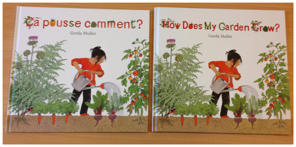
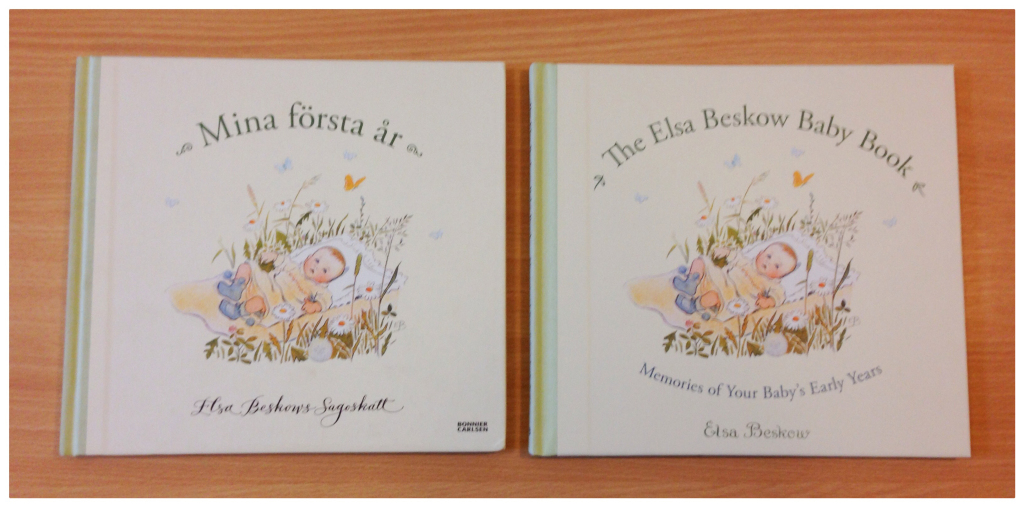
At Floris Books, we bring lots of books into the English language market that were originally written in foreign languages. At large annual book fairs, we meet up with foreign language publishing houses to find out more about their books. If we find a book that we think would do well in an English-speaking market, we buy the English language rights to that book, allowing us to publish it in that language. Here’s two of our lovely co-productions:
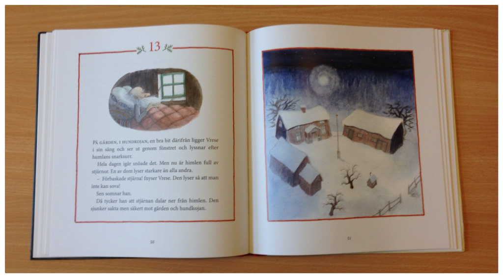
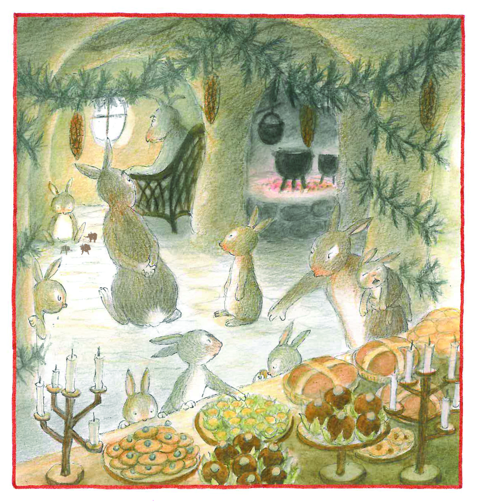
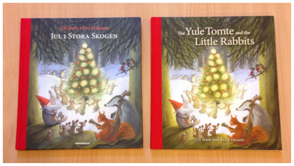
Floris Books first saw The Yule Tomte and Little Rabbits at Frankfurt Book Fair, where we fell in love with it! Ulf Stark’s story is heart-warming and Eva Eriksson’s illustrations are wonderfully charming; we were sure an English edition would be popular. #FlorisDesign has a particular soft spot for this book because we worked closely with Rabén & Sjögren, the original Swedish publisher, to produce the final print book. When two different publishers work together to print the same book in more than one language, that is known as a co-production.
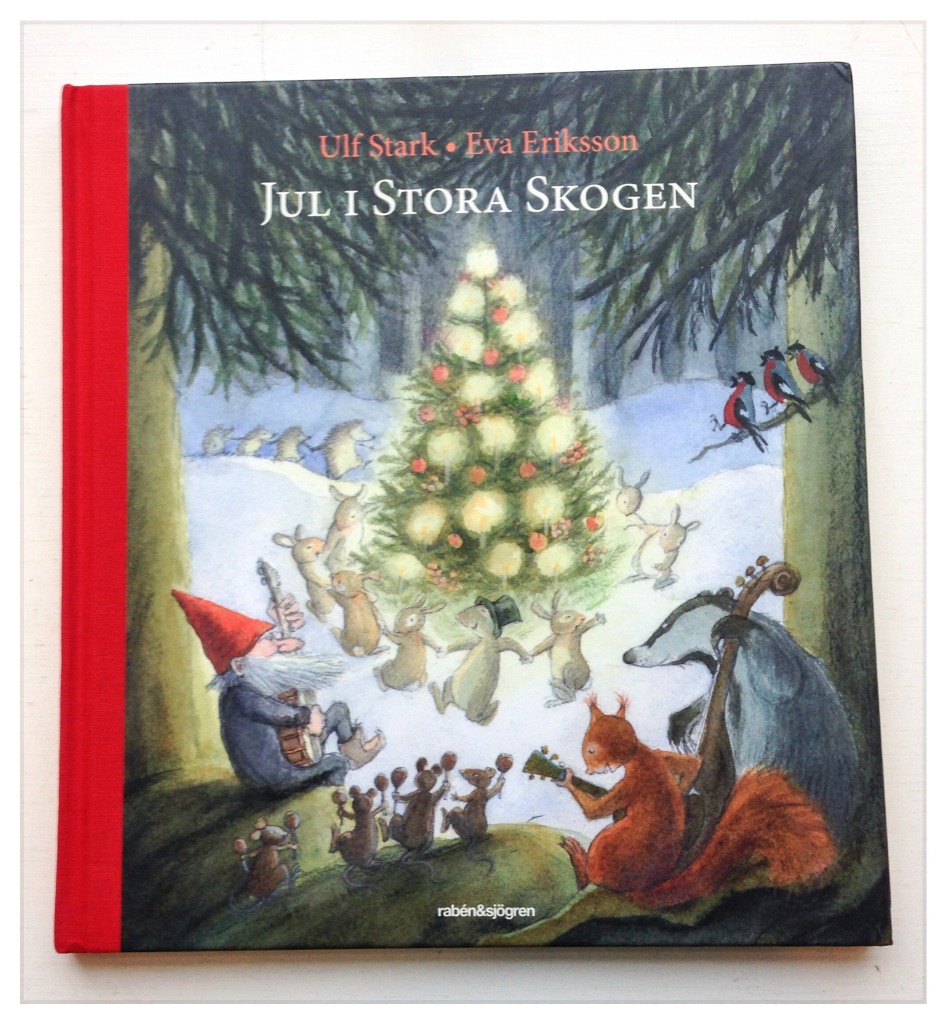
This cover charmed the socks off Floris Books! The title Jul I Stora Skogen is roughly translated as Christmas in the Big Forest.
The more copies of a book a publisher prints, the cheaper the unit price of each copy becomes. For a more cost-effective print run, Rabén & Sjögren and Floris Books decided to co-produce this book i.e. they would print both Rabén’s Swedish copies and Floris’s English copies all at once. But how does this work if they contain different words?
This is where the magic of lithography printing comes in! On lithography presses, books are printed using four colours that layer over one another to create a full colour image. The colours used are Cyan, Magenta, Yellow and Black (CYMK – the K standing for Key, meaning black).
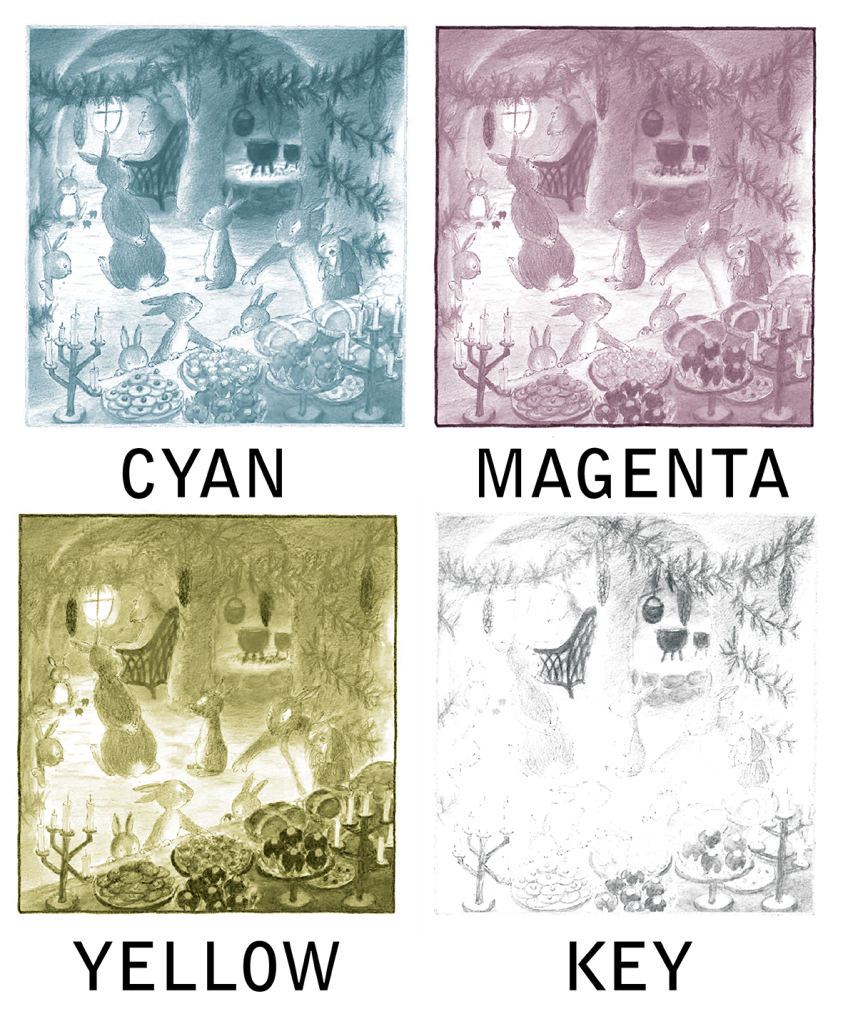
This is what an image looks like when it’s split into cyan, magenta, yellow and black – the layers all work together to create a full image!
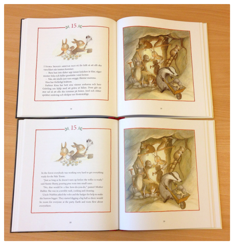
In co-productions, publishers need to make sure that all of the things they want to be unique to their edition of the book – like the text – are in black only. All the other features that are common to all editions are in colour. For The Yule Tomte and Little Rabbits we made sure that our English text was all in black only and Rabén & Sjögren made sure their Swedish text was all in black only.
At the printers, cyan, magenta and yellow layers were printed first on every single inside page belonging to the two language editions. Then the pages that would belong to the English edition and those that would belong to the Swedish edition were separated. The pages belonging to the English edition were finished off by using the black colour to print the English words. At the same time, the black Swedish text was being printed to finish off the Swedish pages.
On the cover, because the text is in colour, both Rabén and Floris had to supply CMYK files so that the whole printed cover would be unique to their edition.
In the end we produced a beautiful book that makes us really excited for Christmas, no matter what time of year it is!
To celebrate Advent and the Christmas season, from Monday 1st December we’ll be sharing exclusive chapters and pictures from The Yule Tomte and the Little Rabbits on the Floris Blog – one chapter a day until Christmas Day! Make sure to check back every morning for an Advent treat.
And if you’d like to find out more about The Yule Tomte and the Little Rabbits – or maybe add it to your festive bookshelf! – you can read about it here.
