Book covers: from concept to creation
by Floris Books • 11 March 2015 • Floris Design • 0 Comments
Once upon a time, a writer wrote a novel and a publishing house decided that it was so fantastic, they wanted to share it with the rest of the world.
“This story will reach so many more children if it is has a wonderful cover!” the writer said.
“We agree,” said the publisher, “we’ll get our best designers on it at once!”
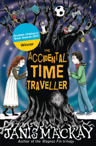
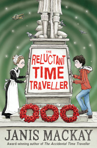
And that’s where I come in; my name is Leah and I’m the designer at Floris Books. In my last blog post I shared all of the work that illustrators and designers put into creating the visuals for a picture book. This week for #FlorisDesign I’ll be revealing all the behind-the-scenes work that goes into creating a book cover. Come with me on a journey through the cover illustration of The Accidental Time Traveller and its sequel The Reluctant Time Traveller by the brilliant illustrator Nicola L. Robinson!
- Creating the concept
Similar to the picture book process, the whole process begins for the design department when an enthusiastic editor appears with a synopsis for a new novel. They brief me on the story: what it’s about, the age-range it’s for, and the names of books they think it will be competing against to catch readers’ eyes.
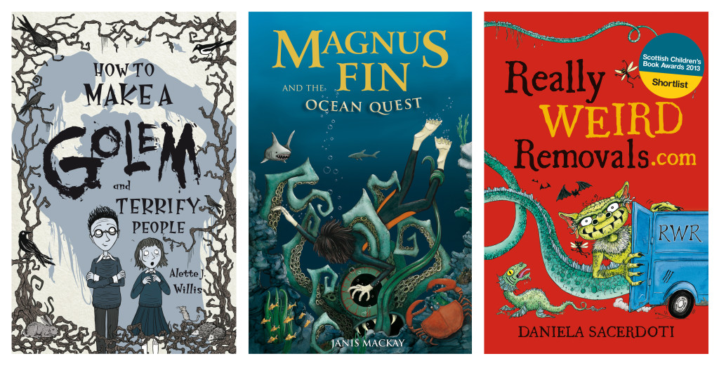
Between all of the employees of Floris Books, we have enough expert knowledge on the UK children’s book market to sink a ship. We know what kind of book covers attract readers and we know what kind puts them off. Based on this, we come up with the core ideas (also called concepts) for our covers.
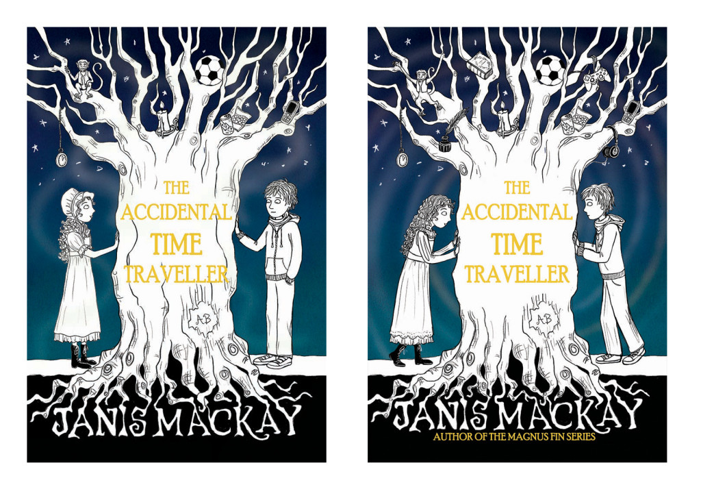
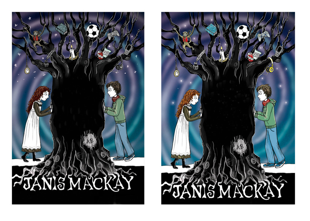
For The Accidental Time Traveller cover we decided that we wanted to show the parallels between the two main characters, both of whom belong to two different time periods. We also wanted to include the yew tree as it plays an important role in the time-travel aspect of the story.
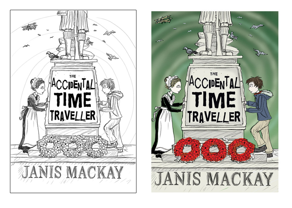
For the sequel, The Reluctant Time Traveller, we wanted to match the first book in composition and style. Because it is set during World War I, we thought that using a Scottish war memorial as a focus with the two main characters either side would be a strong, clear concept. Both of these concepts are bold enough to ensure that they’ll be enticing even when the covers are shrunk down to thumbnail size in online eBook stores.
A lot of thought and heated discussion goes into the concept creation process! To get a full idea of exactly how much work it takes, and for more information about why we look closely at the competition that’s already out there, read this first-rate #FlorisDesign blog post.
- Illustrator search and commission
Once we’re happy with the concept, we need to find an excellent illustrator to bring it to life! Nicola L. Robinson has illustrated covers for Floris since 2009 and she’s always created brilliant results. We thought she would be a perfect match for the Accidental Time Traveller concept and that her quirky style would really appeal to the book’s target market. Nicola agreed and the rest is history. When it came to publishing The Reluctant Time Traveller one year later, Nicola was the obvious choice for the job as cover illustrator!
- Briefing
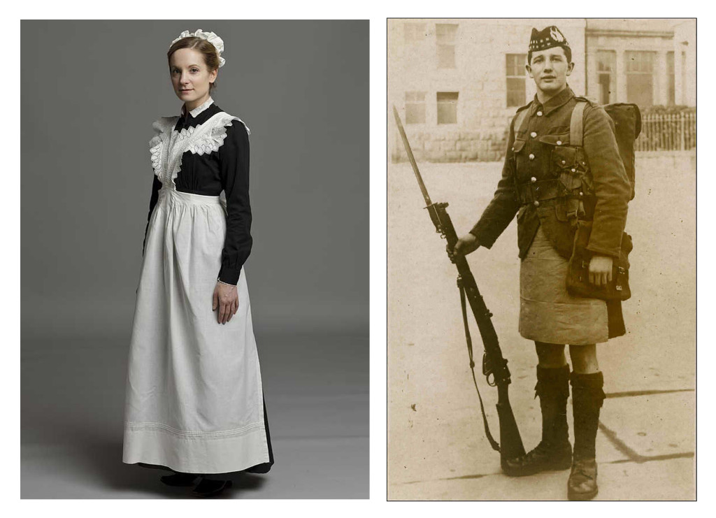
It’s at this point that I need to convey our wonderful concept to the illustrator. I do this by writing a cover brief that includes all the information the editor has given, plus a little more. I explain the concept in a way that still allows the illustrator to have some fun and inject his or her own personality and style into the project. I also include reference photographs of anything we need to be accurately illustrated (for The Reluctant Time Traveller that was the historical clothes).
Any important items that must be included in the illustration also have to be specified in the brief; for example, we wanted some poppy wreaths along the bottom of the memorial on the cover of The Reluctant Time Traveller. Nicola included these but also added in some pigeons (as they’re always hanging around statues) and bi-planes in the sky, which we loved.
- Roughs
Once Nicola gets a cover brief, she swiftly locks herself in her studio and begins work. The first thing an illustrator produces in reaction to a cover brief is a rough drawing of the concept. This allows the publisher to see how the illustrator has interpreted their idea while it’s still at the stage where it can be altered if needs be.
When Nicola sent us the first rough of The Accidental Time Traveller cover, we were instantly sure that she was the right woman for the job! We had a few tweaks to make though, so we sent our feedback and Nicola sent in a second rough. Everyone was happy with this version, so it was approved for colouring. Nicola likes to provide a colour rough at this stage, which is brilliant as it allows us to approve the colour palette she plans to use before it’s set in stone. At this stage we’ll show the author the illustrator’s work so we’re sure they’re happy with the way it’s going.
- Final artwork
And there you have it! That is how an illustrated book cover comes into being. It’s at this point that the marketing department start sharing the cover with everyone and shouting about how great the upcoming book will be. The design team need to start thinking about what kind of snazzy cover effects they want to add to it.
Once the book is printed and held in the hands of both author and illustrator, the cycle is complete (on the design end of things, anyway)!
And so Nicola L. Robinson and Floris Books lived happily ever after. But what about the Time Traveller we’ve heard so much about? There’s only one way to find out and that’s to read the books for yourself!
If you want to find out more about how books are printed, another of our Kelpies authors wrote a blog post about her trip to the printers with Floris Books.
If you love Nicola’s artwork as much as we do, be sure to read her #FlorisDesign interview and visit her website.
