#FlorisDesign Illustrator Interview: Luke Newell
by Floris Books • 11 February 2015 • Floris Design • 0 Comments
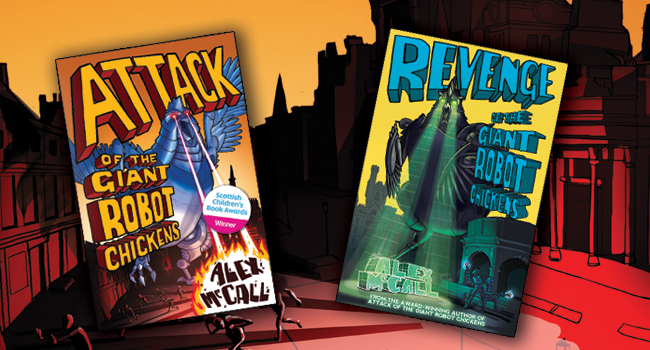
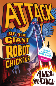
The Giant Robot Chickens are back and they want revenge! Their illustrator, Luke Newell, isn’t quite as vengeful, though his cover illustrations sure do pack a punch! #FlorisDesign interviewed Luke to find out how he makes those chickens on his eggs-cellent covers for Alex McCall’s Attack of the Giant Robot Chickens and Revenge of the Giant Robot Chickens look so darned evil.
Hi Luke, thanks for chatting with us today. Your apocalyptic Attack of the Giant Robot Chickens cover drew a lot of interest since its release in February 2014, and now you’ve gone and created another cracking cover for Revenge of the Giant Robot Chickens which was released in July 2015. It’s got us wondering, where did you find your inspiration?
From the stories and the briefs, I got a clear tongue-in-cheek, 1950s sci-fi ‘B-Movie’ feel, so that’s what I went for. I looked at posters for movies like Forbidden Planet (Robby the Robot!) and Attack of the 50ft Woman (a giant woman attacks California!)
We bet California wasn’t expecting that! Then again, we doubt Aberdeen was expecting giant robot chickens… So do you have a favourite spot to work in?
I work in my lavish studio… the corner of my dining room!
What was your favourite part of the Chickens covers to illustrate?
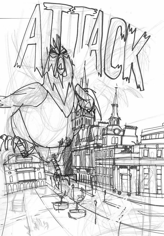
I really enjoyed designing the chickens. It was a great challenge to try to find a balance between funny and scary!
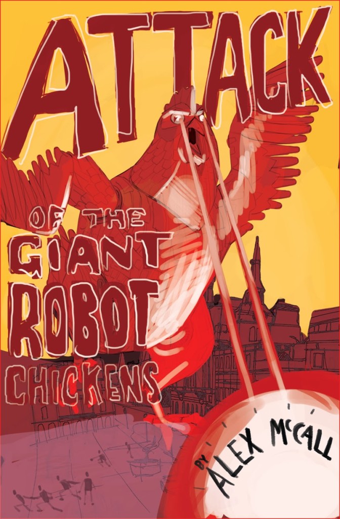
(Rough sketches)
Well we think you managed with aplomb! So what made you want to become an illustrator?
I’ve always loved drawing, but I really love telling stories with drawings… and I REALLY love making people laugh, so if I can do it with a drawing that’s great. Growing up, I loved The Beano (Dennis the Menace!) and Tintin. Hergé who wrote and drew Tintin is a GENIUS. Also I love Aardman Animations (Wallace and Gromit, etc) and The Muppets!
So do we! The influences you’ve listed are a real mix of traditional and digital art; how do you prefer to work?
I work digitally for the main bulk of final artwork. There are so many great tools nowadays, it’s easier, faster, and generally I deliver artwork digitally via email so it just makes sense. But for all ideas work, and foundation design work, pencil and paper is still the best!
A lot of our illustrators have said the same thing. So when you’re not drawing apocalyptic robotic chickens, what’s your favourite thing to illustrate?
I think people are really appealing to not only draw, but watch. Even if I’m drawing a tree, or a building, I still apply a human character, or emotion to it. Other people are a source of endless inspiration.
And what do you do if you get stuck on a brief?
Exercise is really good for this! Either a walk or a bike ride… gets the blood pumping, takes your mind off the brief for a moment and lets the ideas ‘occur’!
Exercise seems to be the key! Almost all of our illustrators have said this too. You mentioned a few illustrators and animators who inspired you to become an illustrator/animator, do you have a favourite?
This is an incredibly hard question. Hergé is probably the biggest inspiration, but I could list twenty-five people that I admire who are working today: Annette Marnat, Scott C, Vera Brosgol, Oli Josman, Graham Annable… I’ll stop there. Why? They all have excellent drawing skills, and are able to boil something down to its essence.
And finally, because you are both an animator and an illustrator, do you ever think about how your 2-D characters would move and act if they were animated? Do the two disciplines compliment one another?
Absolutely. Animation is really just a sequence of illustrations… Or, to put it another way, an illustration is a chosen moment from a potential animation! I will often try out various poses for an illustration to find the right one, almost as if I’m taking the character for a walk, and then seeing which one works best. Also, to animate a character, you have to have a good sense of what that character looks like from all angles… even something that ends up looking ‘flat’ in the final illustration, I need to know what it (might) look like all the way round to get the shapes right.
That’s a really interesting way of looking at it! Thanks again for chatting with us Luke!
 Luke was awarded a BA in Illustration at Kingston in Surrey in 2001. To see more of his amazing work you can visit his blog, his website or even follow him on Twitter.
Click on the covers for more info on Attack of the Giant Robot Chickens and Revenge of the Giant Robot Chickens and to use our exciting See Inside feature!
This interview previously appeared on www.discoverkelpies.co.uk
